Duke’s Proposed Mandatory Fee: Unjust and Bad Energy Policy

Duke Energy is trying to triple the mandatory fee that South Carolinian’s Duke customers pay before they use the first kilowatt of electricity. Duke Energy filed significant rate increase requests with the Public Service Commission that will: a) hit particularly hard on 
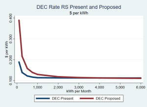
poorer South Carolinians, older South Carolinians, and renters and b) discourage investments in energy efficiency and alternative energies. Duke Energy Carolinas (DEC) and Duke Energy Progress (DEP) are seeking to raise electric rates for their typical residential customer (1,000 kWh per month) by 14 percent. A large component of that is increasing the “basic facilities charge” from $8.35 (DEC) and $9.05 (DEP) monthly to $28.89 (DEC) and $29.00 (DEP).

As the chart to the right shows, for DEC’s RS Rate Schedule (residential service that is not all-electric), the percent increase in monthly costs declines rapidly as use grows. T
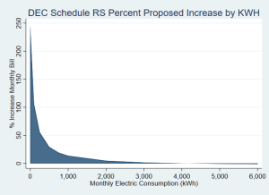
he typical DEC RS electric customer faces a 13.68 % increase monthly compared to a very high use residential customer whose bill would actually go down. The pattern is the same for DEC’s RE all-electric rate and for DEP, although the highest DEP users still face an increase, but only 3.1 %.

To hear the utilities tell the story, poor people are the high users because they live in energy-inefficient homes, with poor insulation, old heating and cooling equipment and use inefficient home appliances. Oh, they’re also bad consumers according to the utilities. Some low-income consumers who live in old mobile homes with ancient electric strip heating may pay more. We need to expand public and utility programs to address energy efficiency in our poor housing stock.

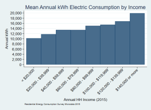
Surveys conducted by the Energy Information Administration[1] tell a very different story than the utilities—electric consumption is highly correlated to income. This graph shows us that in the South Atlantic Census Division those with 2015 household incomes up to $20,000 used only 10,219 kWh in the previous year, or 908 kWh per month. That compares to nearly twice the consumption (19,971 kWh annually and 1,660 kWh monthly) for those making over $140,000.

Undisputed research tells us that low-income customer
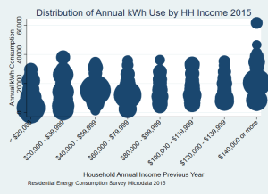
s suffer from high energy burdens. That’s because their energy costs are high for their income—not because low-income consumers are high electricity users. The chart at the right shows the weighted distribution of electricity use within income groups. The highest consumers among low-income customers are lower than for all other income groups. Low-income people simply reduce electric consumption … even if it means living in the cold (or hot) and dark.

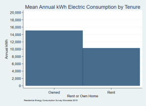
We see similar patterns if we look at renters versus owners: 858 kWh per month for renters compared to 1,257 kWh per month for owners. Consumers 65 and above used 1,062 kWh per month compared to 1,141 kWh on average for those under 65.

The effect of front-loading costs is that the per kWh cost declines as consumption increases. A typical DEC RS rate customer, who uses more than the average lowest-income customer, pays 12.9 cents per kWh. The highest users, who are better off, pay only 11.1 cents per kWh. And it means that our most vulnerable are paying significantly more per kWh than better off Duke consumers.

This is unjust, but it is more than unjust. Because you pay less per kWh as your consumption increases, you’re less inclined to invest in energy efficiencies like better insulation or more efficient household equipment, including heating and air. You also have less incentive to invest in alternative energy sources. While public policy should drive us to energy conservation, a front-loaded rate design sends us in the other direction.

For low-income customers, this is especially burdensome. By taking nearly $30 every month out of an already tight budget before any electricity is used, you take funds that otherwise could be used to improve energy efficiency in your home. Not only do you have a lower incentive to invest if each addition kWh costs less, a high basic facilities charges means you no longer have the money to invest in saving energy costs. You have lost control of your ability to save on electric costs.

A number of organizations will oppose these high mandatory fees. Consumer advocates will push for public hearings in the DEC and DEP service territories when hearings begin. The PSC must hear from consumers that they should reject these substantial increases to the basic facilities charge in order to protect lower income, older and renter customers and to encourage energy conservation efforts. The high mandatory fees are both unjust and bad energy policy.

[1] U.S. Energy Information, Administration, Residential Energy Consumption Survey (RECS) 2015 Survey Data (December 2018) at https://www.eia.gov/consumption/residential/data/2015/index.php?view=microdata. All analyses presented here are for the South Atlantic Census Division because the sample size does not support state level estimates. This is the most reliable data available on residential electric consumption.

Posted in Energy Policy, Utilities | Tagged , , , | Leave a comment

Every Family in SC Pays Taxes: The Poorest Pay a Larger Share of Their Income than Wealthiest

As the S.C. General Assembly looks to do “tax reform,” a new report, Who Pays? A Distributional Analysis of the Tax Systems in All 50 States by the D.C.-based Institute on Taxation and Economic Policy [ITEP] illuminates the flawed premise which underlies the effort to make our taxes “lower, flatter and fairer”.

Focused especially on lowering income tax rates for upper income taxpayers, those efforts would push income tax burden further down the income scale. Looking at state and local taxes as a whole, the distribution of taxes paid by SC families is already, compared to most other states, relatively flat across income groups, except that our highest income families contribute a lower percent than most South Carolinians. Shifting income tax shares from upper income families onto lower-income families makes our tax system less flat and less fair … not more.

Who Pays? shows that our lowest income families, those below $19,400 annual income in 2015, pay 8.3 % of their income to state and local taxes under laws in effect on September 10, 2018.[1] For the top 1 % of family incomes, above $416,000, only 6.8 % of that income goes to state and local taxes. Our state and local taxes are regressive when our lower-income families are contributing more as a share of income than our wealthiest families.

Driving differing shares at different income levels, the below table shows, is that the bulk of tax revenues come from progressive taxes on income and regressive sales and excise taxes. When you combine them with the moderately regressive property tax, you produce a combined tax burden that is higher on poor people (and the middle class) than on our wealthiest families.

So, to improve fairness, we should fix the particularly regressive features of our income tax code:

  • Make our Earned Income Tax Credit refundable so that those who don’t owe income taxes can access it.
  • Tax ordinary income and capital gains at the same rate, instead of ignoring 44 % of capital gains income.
  • Tax pass through income at the same rate as other personal income.
  • Make any tax credits that offset sales, excise or property taxes refundable so that lower-income households can access those credits.
  • Reimpose the tax on large estates and inheritances.

At the same time, when the General Assembly looks at sales taxes, the way to lower sales tax rates is to expand sales taxes on services and not onto the higher-dollar exemptions on items like groceries, drugs, and household electricity and water that make our overall tax system less regressive.

And, as nearly every member of the General Assembly knows, they should repeal Act 388 that eliminated property taxes for school operations on owner-occupied homes. They paid for it, largely, by increasing the regressive general sales tax and shifted property tax burdens onto businesses and renters. That would take more courage than anyone believes they have.

As the General Assembly moves to “tax reform” discussions in 2019, there should be a full recognition that there are no “noncontributors”. All South Carolina families pay taxes and families in the lowest 20 percent of incomes pay 22 % more in state and local taxes as a share of income than those in the top 1 percent. If they only look at income taxes, they will not see the whole picture.

[1] South Carolina adopted  H. 5341 on October 3, 2018 to update our conformity and nonconformity with federal tax law. Analyses of that legislation suggests that the final bill has a slightly progressive effect, though not enough to change the general shape of the distribution in South Carolina as described in Who Pays?


Posted in SC Budget, Taxes | Tagged , , | Leave a comment

Columbia’s Ballpark Study: Ask the Wrong Questions and You’ll Get the Wrong Answers

When public bodies get poor information, they make poor decisions. Mayor Steve Benjamin appears ready to push Columbia City Council to make such a poor decision on Tuesday (1/21/14) when it takes up a resolution to direct the City Manager to negotiate a deal to bring the Savannah Sand Gnats to Columbia.

The City of Columbia hired Brailsford & Dunlavey (B&D), “a program management firm with comprehensive in-house planning capabilities,” to conduct a feasibility study regarding minor baseball in Columbia. Not surprisingly, B&D concludes that a minor league operator can make money in Columbia—so long as the City puts up enough money for a ballpark. You really didn’t need to pay someone $47,000 to answer the question: “If a City the size of Columbia builds a nice enough ballpark for her, can a minor league operator make money on an A level team?” The answer is always “Yes” if the deal is sweet enough.

That study, essentially a slide show since any underlying study had not been completed by the Thursday (1/16/14) evening presentation we attended, lays out a compelling argument for an owner but provides little of value for decision-makers on whether building a publicly-funded ballpark is a good deal for the city and its citizens.

As Jason Thompson of B&D conceded at the meeting, they have presented a “benefits analysis”—exactly what the City contracted to pay them for—and not a “cost-benefit analysis”.

We have previously written on the general consensus among economists that publicly funded ballparks are not good deals for the communities that fund them. The relevant questions Council should ask are: Will the ballpark produce new revenues or simply suck up monies currently being spent in other businesses (substitution)? How much of the economic benefit leaves the community through, for example, out-of-town owner and concessionaire profits and the costs of goods and services produced elsewhere (leakage). What are the opportunity costs of this investment? Would the community get a better return putting the money elsewhere?

B&D does not even pretend that Columbia will be a destination city for out of area fans. That means that dollars spent at the ballpark will be discretionary expenditures that would, in all likelihood, have been spent in another entertainment venue in Columbia: at a restaurant, at a museum, at the Zoo, at Frankie’s Fun Park, at a movie or any of the other myriad opportunities our community already has. But you wouldn’t know that from reading B&D’s slide show and its presentation of benefits.

The B&D report claims 715 jobs from the ballpark, but in responding to questions, the B&D reps said that there were 25-35 full-time jobs and about 250 part-time, hourly service jobs with a club. And their estimates of pay levels at Thursday’s meeting are substantially higher than suggested by industry reporting such as Josh Leventhal, Minor League Jobs Marry Love Of Baseball And Little Pay, Baseball America (March 10, 2010). In effect, you trade existing jobs for a hand-full of “new” jobs.

Likewise, when economists look at the construction spending and jobs, they find it a wash. Sports venue construction simply replaces construction that would otherwise have taken place. But the B&D report simply takes the money spent on a ballpark, applies multipliers and reports the outputs. They don’t look at forgone investments or the impacts of one construction project on the costs and feasibility of others.

Even the most favorable economic research can only find an increase in per capita income, a good measure of effective economic development, in places with AAA or Rookie level teams. No such finding exists for the A ball that Columbia is looking to entice here.

Much of the discussion when a ball club wants to come to town is over “the deal.” How much will the City cover and how much will the owner? Will revenues to the City from lease payments and hospitality taxes compensate for the City’s contributions, including ongoing operations and maintenance costs? Those are far from the most important questions, but even those are not addressed by B&D.

The real question is: Will the economy and well-being of our community be enhanced by constructing a public ballpark with sufficient revenue-enhancing amenities that an operator is willing to come to Columbia to make money despite the very real negative impacts on the businesses currently operating in Columbia when you put 400,000-500,000 consumers at the new ballpark?

That’s a very different question than the City asked B&D to answer. It’s easy to listen to the hucksters … and anybody who makes a living in minor league baseball shares a lot of DNA with P.T. Barnum. And it’s easy to look at a quick and dirty boiler plate “benefits analysis”. You look at the “bottom line” and it always sounds like a great deal. The problem is that it isn’t the bottom line, because no one was asked to tot up the costs not only to the City and its coffers and its taxpayers but also to the business community.

The report the City commissioned is of no real value in informing Council on the wisdom of this significant investment. They asked the wrong questions. If City leaders don’t have the answers to the right questions, how can they reasonably make a good decision for the City?

Posted in Economic Development, Impact Studies | Tagged , , | Leave a comment

Look at the Net Effect of Economic Development Investments

We have been watching the City of Columbia’s decision-making on the Bull Street Neighborhood Development, the sale and development of the SC Department of Mental Health properties.  A significant piece of the sales pitch for that is an analysis prepared by Miley and Associates of The Economic Impact of the Transformation of the Bull Street Property (June 27, 2013) for the Greater Columbia Chamber of Commerce. That analysis concludes that “The total economic impacts of the development of Bull Street would generate more than $1.2 billion of economic activity per year, $581 million in labor income and more than 11,000 new jobs when completed.” (p. 18)

At the July 1 public telling, Mayor Steven Benjamin presented a slideshow comparing these returns favorably to Boeing expansion in North Charleston on a bang for the buck basis. Such a comparison is simply wrong-headed and underlines the fundamental flaw in the use of this kind of economic impact analysis. The Boeing project and its investment and employment impacts is essentially all new. No other plane maker in South Carolina is losing business because we invested in Boeing. Nobody in South Carolina who was going to buy another kind of plane won’t because they decided to buy a Dreamliner from Boeing. Such incentives to recruit manufacturers who will export practically all of their output without competing with existing South Carolina businesses can be a good deal for South Carolina.

But that kind of analysis, if applied to Columbia and its environs, does not apply to the Bull Street Project. The bulk of the economic activity is the result of construction of homes, apartments, offices and parking garages in that chunk of Columbia.  Unless you assume that the Bull Street project will cause people to move to the Midlands, everyone buying or renting a home in the development would have bought or rented a home somewhere in the Midlands. This may be economic activity, but it’s not necessarily new economic activity. Likewise, the new offices in the Bull Street Neighborhood would have been built (or remained occupied) somewhere else in the Midlands, much as the people employed there would have been employed somewhere else. It would take a pretty complex analysis to determine the net regional benefit or loss of creating in this particular place and time a large inventory of new homes, apartments and office buildings. We suspect that the net economic activity is fairly small at best. You’re just moving around economic activity that would take place in any case.

Likewise, the study looks at Estimated Annual Property Tax Revenues at page 15, assuming a $60 million increase in assessed value. That includes an increase to the county of $2.2 million annually. But that assumes that none of these buildings would have been built in Richland County and that the housing and office stock buildup does not undermine the value of existing buildings, thus lowering county taxes. The same applies to school taxes. Clearly, replacing a large chunk of untaxed land within the City with taxed properties helps the City’s coffers, as long as providing services to the neighborhood costs less than the $4.3 million estimated increase of revenues. That $4.3 million number also assumes that none of the development that would have taken place within City limits absent the Bull Street Neighborhood Development.

Miley and Associates used appropriate data and methodologies in their study.  They used the respected IMPLAN model to develop their estimates. We don’t quibble with their numbers. But public officials who read these studies have to understand what they are … and what they are not. Perhaps the Greater Columbia Chamber of Commerce should be embarrassed for not asking their economic consultants to look at the net impact of this development.

Saying you brought a billion dollars in economic activity to your community is a great campaign speech. But City planners and elected officials have an obligation to ask about the net benefit when looking at a project like this. They may well conclude that it’s worth doing. But they should not be doing it based on only half the story. They should always insist on careful assessment of the net benefit—how the economy of the City and its environs will be better if they do the project or make the investment as opposed to not doing the project. Secondly, they should look at the opportunity cost of the investment. Can something else be done with the dollars, including leaving them with taxpayers to spend, that would provide a better return to taxpayers and the community? Does making this investment block you from more productive investments down the road? The public trust demands no less.

Posted in Economic Development, Economy, Impact Studies | Leave a comment

Does Building a Public Ballpark Make Sense for Columbia?

The City of Columbia’s proposed Development Agreement: Bull Street Neighborhood with Greenville’s Hughes Development Corporation includes an effort to build a new baseball stadium in order to attract a minor league club to Columbia. The City commits (at p. 22 of that agreement) “to consider financing methodologies which could provide approximately $20 million to construct the new stadium and necessary improvements.” Leaving aside whether $20 million will build a new baseball stadium with all the revenue generating features sought by team owners, the question is: “Is this a good economic development investment for Columbia?”

First, let’s be clear. If a minor league club moves to Columbia, I will have season tickets just like I did when the Bombers played in Columbia. I was, for several years until last year, the Co-Chair of the Business of Baseball Committee of SABR, the baseball research society. It’s not about who loves baseball. It’s about good fiscal and public policy.

A large body of academic research has concluded that public funding of sports facilities rarely makes sense from a financial or economic development perspective. The reasons are pretty clear-cut:

  • Minor league baseball does not attract people from outside the immediate area to attend games. If a Columbia team put 400,000 fannies in the seats for all events each year as projected by the agreement, nearly all of those folks would be from Columbia and environs. [Even if minor league teams attracted tourists, we have our doubts about trying to promote tourism for an outdoor summer sport played in “Famously Hot” Columbia.] So it’s not bringing in new revenues—a core test of an economic development investment.
  • Baseball revenues come from discretionary spending. Absent a baseball game, those dollars get spent in existing restaurants, stores and movie theaters. So investing in a ballpark undermines existing businesses without adding to overall well-being.
  • Minor league clubs do not create many jobs and those they do create are generally low-paying and part-time. Visiting ball clubs, umpires and major-league affiliate employees simply don’t generate enough nights at cheap motels or meals at fast food places to drive an economy. Nobody is going to start a bat or baseball factory to support the ball club. A minor league ballpark is essentially an outdoor restaurant with entertainment, not the catalyst for new restaurants around it.
  • Unless cities drive much better deals than they usually do, the costs will outweigh the revenues. Do we need to discuss Columbia’s history here?
  • In any municipal economy, a sports team comprises a vanishingly small part of the economy—far too small to drive growth. The impact on personal income is insignificant.
  • Even if you could show some benefit from a ballpark, the commissioned studies to justify the expenditures almost never look at the opportunity costs of that investment. If we don’t plunk $20 million down for a ballpark, could we better invest those dollars for a more meaningful return (on infrastructure, education or workforce development to name just three possibilities) or get a better return by leaving Columbia taxpayers with more money to spend in existing businesses?

Does it ever make sense for a city to fund a ballpark? Some researchers who look at the question conclude that if the ballpark is a part of an urban revitalization or a “festival center” with many destination facilities located in a cluster then it makes sense. Classic examples are Baltimore’s Camden Yards and the collection of sports venues in Indianapolis or Columbus, Ohio. Here, the “festival center” rationale does not apply.

The development of the Bull Street Neighborhood is apparently going to occur. What is unclear is what impact a ballpark will have on the success or failure of that development. If it will have a significant positive impact on the development, why doesn’t Hughes Development Corporation pony up the funds? Or the owner of the new team? If it made economic sense they would … unless another sucker is willing to do it for them.

In the end, the rationale for public funding of a ballpark—and there is nothing politicians love more than throwing public money at rich people—will be pretty squishy. They will relate to things like standing. “Without a bush league ball club, Columbia will look like a bush league city.” Or culture—how important baseball is to the soul of America. Or how much the Mayor and other powerful people love the game. There is little research on any of those, which makes them quite handy for selling a ballpark which can’t honestly be sold on financial or economic development grounds.

I hope we get a stadium and a ball team. But the taxpayers who don’t enjoy or benefit from them shouldn’t have to put up the money to subsidize my hobby.

Posted in Economy | Tagged , | 1 Comment

Medicaid Expansion Would Help Working South Carolinians

Some 700,000 South Carolina non-elderly adults aged 19 to 64 lived at or below 138 % of the Federal Poverty Level (FPL) in 2011.[1] The Affordable Care Act expands eligibility for Medicaid to those with incomes below 138 % FPL. Children at these income levels are already covered under our Medicaid and seniors 65 and above are nearly all covered by Medicare. Of those 700,000 nearly half (46 percent) reported themselves as uninsured in 2011.[2]

A large proportion (two-thirds) of South Carolina’s uninsured non-elderly adult population (ages 19-64) at or below 138 % of the Federal Poverty Level was either employed or unemployed but seeking work. Among them two-thirds were employed (40 percent) or unemployed but in the labor force (27 percent). One-third was not in the labor force.

South Carolina is generally a low-wage state, ranking 44th among the 50 states and the District of Columbia for annual median wage. (ftp://ftp.bls.gov/pub/special.requests/oes/oesm12st.zip.) Two-thirds of South Carolina workers are in occupations where half the employees make a wage which would qualify a full-time (40 hours per week) worker with a family of four for the Medicaid Expansion under the Affordable Care Act.

Table 1 – Percentage of Workers Earning a Wage That Would Make a Full-Time Worker Income Eligible for Medicaid Under Expansion (Based on Family Size) in 2012


Family Size

Occupational Category

% of SC Work Force

2

3

4

5

Food Preparation and Serving Related Occupations

9.70%

75%+

75%+

90%+

90%+

Personal Care and Service Occupations

2.40%

50%+

75%+

75%+

90%+

Building and Grounds Cleaning and Maintenance Occupations

3.70%

50%+

75%+

90%+

90%+

Sales and Related Occupations

11.40%

25%+

50%+

50%+

75%+

Healthcare Support Occupations

2.80%

25%+

50%+

75%+

90%+

Farming, Fishing, and Forestry Occupations

0.20%

25%+

50%+

50%+

75%+

Transportation and Material Moving Occupations

6.80%

25%+

50%+

50%+

75%+

Office and Administrative Support Occupations

16.00%

10%+

25%+

50%+

50%+

Protective Service Occupations

2.40%

10%+

25%+

50%+

50%+

Production Occupations

9.80%

10%+

25%+

50%+

50%+

Source: US Dept. of Labor, Bureau of Labor Statistics, Occupational Employment Statistics: South Carolina (May 2012).

The two largest industries with uninsured employees who would be Medicaid eligible are Restaurants and Other Food Services and Construction. For the most part, the industries Uninsured by Industryin which the uninsured working poor toil are the industries that take care of us, our parents and our children.

If instead of looking at industries (who you work for) we look at disaggregated occupations (what you do), we see this even more clearly. The most populous uninsured occupations are cashiers, maids and housekeepers, cooks and waiters and waitresses.

Wholly aside from the compelling justice and Uninsured by Occupationeconomic arguments for a Medicaid Expansion, the people who interact with our lives most intimately— handling our food, our cash and cleaning our homes and hotel rooms—are most likely not to have health coverage and reasonable access to health care. Think about that the next time you go to a grocery store or restaurant. That’s a public health concern.

SCDHHS Director Tony Keck suggests that major portions of the uninsured will be covered under the Health Insurance Marketplace (what we used to call the Exchange). If South Carolina fails to expand Medicaid, businesses with more than 50 employees could face $30-$46 million in potential shared responsibility liabilities according to Jackson-Hewitt Tax Service as employees making between 100 percent and 138 percent of the Federal Poverty Level, but not covered by their employer, enroll through the new Healthcare Marketplace. If South Carolina expanded Medicaid, those employees would be Medicaid eligible and their employers would not be subject to the shared responsibility tax liability of $2,000 to $3,000 per employee who enrolls through the Marketplace.

That still leaves 80,000 working poor South Carolinians uncovered.

Many uninsured working poor are employed in small businesses. Although those small businesses won’t face penalties for failing to cover employees, the ability to cover lower wage workers through Medicaid relieves financial pressures on the businesses, making it easier for them to provide coverage to their other employees.

The Medicaid Expansion makes sense for South Carolina workers and South Carolina employers.


[1] Unless noted otherwise, data is taken from the American Community Survey’s Public Use Microdata Survey (PUMS) 2011 data. That is survey data which must be used with care, especially as you try to break out different categories. We could trend this data to 2014, but that simply adds speculation to imprecision.

[2] Here we will focus on the uninsured, although it is important to recognize that telling the Census Bureau that you have health insurance is not the same as having good health coverage, whether because you bought a lousy policy or your policy has such large co-pays and deductibles that you can never afford actually to use it. There is overlap, but 37 percent reported having insurance through and employer or union and 12 percent having purchased coverage directly. The largest proportions of insured adults under 138 % had coverage from Medicaid (47 percent) or Medicare (17 percent).


Posted in Health Care, Medicaid Expansion, SC Budget | 2 Comments

Non-Tax Revenues: It’s Really About Making Higher Education Unaffordable

In a recent editorial in The State, Cindi Ross Scoppe points to the highest in the nation share (48.4 %) that non-tax revenues made in 2010 of state and local revenues. “Our non-tax revenue in 2010, the latest year analyzed, was the highest, by far, of any state. And it was up from 37.8 percent in 2000 — the largest increase, by far, of any state.” Scoppe took the numbers from a distributional analysis of taxes in South Carolina by the D.C. based Institute on Taxation and Economic Policy (ITEP).

Taxes as a share of own-source revenue have dropped from 62.2 % to 51.6 % of own-source revenues from 2000 to 2010, reflecting, as Scoppe observes the General Assembly’s focus on cutting income tax rates while “averting their eyes while all those user fees, fines and other “non-tax revenues” keep skyrocketing, making our tax system even more regressive — and more opaque.”

Our colleagues at ITEP based their Appendix B: Changes in Composition of State & Local General Own Source Revenues on the US Census Bureau’s State & Local Finance Surveys. Own-source revenues include taxes, charges and miscellaneous general revenue but not utility charges ($3.1 billion in South Carolina in 2010) or payments into trust funds like those for state retirement, unemployment insurance and workers compensation ($5.7 billion). Own-source revenues made up $25.5 billion of the total of $42.3 billion in revenues. Future references to revenue, mean own-source revenue. See our compilation here.

There are perils in comparing summary numbers among states. Here, the driver of South Carolina’s especially high non-tax portion of state and local own source revenues is charges paid to public hospitals—19.9 % of South Carolina’s 2010 revenue and 41.2 % of non-tax revenue. That compares to a national average of 5.6 %, where the states range from 0 % in Vermont to 18.9 % in Mississippi.

That is more a function of the mix of hospitals, demographic shifts and changing health economics than anything structural to our tax or finance systems. If you don’t have many public hospitals, you don’t have much Public Hospital revenue. If you remove Public Hospital charges from the analysis, South Carolina’s percentage of non-tax revenue drops to 35.5 %, substantially below Delaware’s 44.9 %, although still seventh highest. In 2000, that percentage of non-tax revenues, absent charges by Public Hospitals, was 27.7 %.

The next largest category in the non-tax revenues for 2010 is charges by institutions of higher education (8.5 %), an increase from 5.2 % in 2000. Looking at state revenues, alone, higher education charges made up one in six dollars (16.0 %) of revenue in 2010, up from 8.9 % in 2000.

Next in size is Other General Revenue (7.9 %) which includes Fines and Forfeits, Rents, Royalties, Donations From Private Sources, Net Lottery Revenue and unclassified General Revenue. In 2000 that category made up only 4.0 % of revenues in South Carolina, but the Lottery was not yet operating. Fines and Forfeits increased by 284 % from 2000 to 2010, while General Revenue Not Elsewhere Classified grew by 158 %. Together, those two items made up 4.9 % of revenues in 2010, up from 3.0 % in 2000. The growth of revenues from Other General Revenues is especially strong in state revenues with 10.5 % of revenues in 2010, compared to 4.4 % in 2000.

Even in 2000, own-tax revenues made up the larger portion (50.7 %) of local revenues. But those proportions did not change significantly from 2000 to 2010 (50.9 %). In fact, if you remove hospital revenues, local governments in South Carolina became more reliant on tax revenues between 2000 (54.0 %) and 2010 (55.3 %).

As Scoppe observes: “[The General Assembly’s] main interest, besides carving out new specialized exemptions for most-favored donors, is to lower income tax rates, which would get us even further out of [distributional] balance.”

Although increasing fees and fines are a substantial, regressive contributor to the shift at the state level to non-tax revenue, the biggest contributor (leaving aside public hospital revenues) is tuition and fees charged for higher education. As we have moved towards quasi-privatized higher education with rapidly declining shares of state funding, a national trend as well, state appropriated funds for higher education have declined from $7,399 per FTE in FY2007 to $4,095 in FY2012. At the same time, tuition per FTE increased from $4,534 to $6,937. From a distributional perspective, it appears that those tuition increases are not so much regressive as repressive. Lower-income South Carolinians are increasingly unable to afford higher education. That’s a problem.

Posted in Education Funding, SC Budget, Taxes | Tagged , | Leave a comment

The ACA Toolbox for Health Reform: What State Health Leaders Aren’t Telling the General Assembly

The Affordable Care Act (ACA) provides health policymakers with a robust set of tools to accomplish important changes to both bring costs under control and improve our health and health care. The coverage expansion which ensures affordable access to this new, high performance health care system is integral to meeting the those goals, not contrary to them as the state’s health leader is telling the General Assembly.

Figure 1 - with permission of the The Commonwealth Fund

Figure 1 – with permission of the The Commonwealth Fund

When South Carolina Department of Health and Human Services Director Tony Keck travels the state, his central argument against the ACA and Medicaid expansion is that Congress and the White House asked the wrong question: “How do we insure as many people as possible in the United States?”[1] rather than “How do we get as many people healthy in the United States?”

Keck then points to the “Triple Aim” of health policy first articulated by Dr. Donald M. Berwick, former Administrator of the Centers for Medicare and Medicaid Services of the federal HHS:

  • Reduce the per capita cost of health care
  • Improve the health of populations
  • Improve the patient experience (quality and satisfaction).

We agree with Director Keck’s central premise that we should be paying for health rather than health care, but we disagree that they are mutually exclusive.

In a recent presentation on The Commonwealth Fund’s new report, Confronting Costs: Stabilizing U.S. Health Spending While Moving Toward a High Performance Health Care System (January 2013), Dr. David Blumenthal, M.D., M.P.P., Chair of The Commonwealth Fund, used the chart in Figure 1 to show that the ACA helps move us towards the critically needed changes to the health care system to achieve Keck’s stated goals with a toolbox filled with tools for stabilizing health spending and moving us toward a high performance health care system.

The Keck argument seems to be that we have a choice: provide health insurance coverage or improve our health. Our nation (and state) is facing a health crisis:

  1. Massive numbers of uninsured who tax our health systems through inefficient and inappropriate use which often comes too late to be cheap—45 % of non-elderly South Carolina adults with incomes below 138 % of the Federal Poverty Level ($15,856 for a family of one; $32,499 for a family of four) are uninsured[2];
  2. Both a very costly and inefficient health system and costs growing faster than the nation’s economy; and
  3. Poor health outcomes when compared to other nations.

There are ways to address these. The Commonwealth Fund Commission on a High Performance Health System observes:

As national policy leaders consider approaches to slow and stabilize the growth of federal health spending in ways that also benefit all payers (state and local governments, businesses, and households), it is crucial that these approaches be developed and applied to adhere to and further the goals of a high performance health system. These goals include providing affordable access across the nation to high-quality, well-coordinated and patient-centered care with continuous delivery system innovation. Achieving the goals of a high performance health system, while stabilizing cost growth, requires a focus on the total health system and health care markets, not just federal programs. (Confronting Costs, pp. 18-19; emphasis added.)

Director Keck, a creative health administrator who is using his position to push many of these changes in both public and private sectors in our state, presents a completely false dichotomy. Coverage which ensures affordable access to this new, high performance health care system is integral to meeting the Triple Aim, not contrary to it. When he suggests to the General Assembly and its committees that the ACA only addresses coverage, that is completely untrue.

We can have honest differences over whether South Carolina can afford it’s four percent contribution[3] to a Medicaid Expansion between FY2014 and FY2020. But the state’s chief health policy officer completely mischaracterizing the ACA to the General Assembly can only lead us to bad policy choices on the expansion.

[1] Unless otherwise noted, all quotes are from Keck’s January 24,2013, presentation to the Senate Medical Affairs Committee’s Affordable Care Act Subcommittee. Video of that presentation is available at: http://www.scstatehouse.gov/video/videofeed.php. Handouts from that meeting are at: https://www.scdhhs.gov/sites/default/files/Medical%20Affairs%20ACA%20Subcommittee%20FINAL%201.24.13.pdf.

[2] US Census Small Area Health Estimates, 2010, at http://www.census.gov/did/www/sahie/data/interactive/.

[3] SCDHHS never shows the marginal costs of the Medicaid Expansion, instead lumping in the unavoidable costs of the ACA, to demonize the ACA and to throw every chunk of cheese and baloney it can onto the scale of Medicaid Expansion costs. If you simply subtract from the costs of their scenario covering a reasonable estimate of costs of the ACA including an expansion their scenario without the expansion, you get $13 billion in total marginal spending, of which the State would be on the hook for $570 million, counting only some of the potential savings from an expansion. These are derived from SCDHHS numbers provided in Milliman Letter to Keck re: AFFORDABLE CARE ACT- FINANCIAL IMPACT SFY 2014 THROUGH SFY 2020 (November 30, 2012).

Posted in Health Care, SC Budget | Tagged , , , | 1 Comment

Who Pays State and Local Taxes in South Carolina?

Low-income and middle class taxpayers in South Carolina pay a larger share of their income to support our public structures and systems than do our wealthiest taxpayers.

Figure 1

Figure 1

The quality of life we all enjoy in South Carolina is directly connected to those public systems and structures. Our schools, hospitals, social services, parks and infrastructure are what make our communities good places to live and work. But according to Who Pays? (4th ed., 2013), released Wednesday by the Washington-based Institute on Taxation & Economic Policy (ITEP), the top five percent of taxpayers, and especially the top one percent, are not carrying their share of ensuring that our communities are good places to live and work.

As this chart from the report shows, all of us contribute through our taxes, but while our poorest families pay 7.1 % of their family income in state and local taxes, our wealthiest citizens pay only 5 %.[1] This disparity has grown from 1.6 % in 2007 to 2.1 % today when comparing ITEP’s 3rd edition of Who Pays? to the 4th.

All of us are taxpayers. As Figure 2 shows, all of us, but especially our lowest income families, pay a significantly higher share of family income in sales taxes (5.1 % for the lowest 20 %) compared to the hi

Figure 2 - South Carolina Sales Tax

Figure 2 – South Carolina Sales Tax

ghest 1 % (.7 %). As we have shifted more of our taxation from the relatively neutral property tax and the more progressive income tax, that increases the overall difference between our worst off and best off families—shifting ever more of the responsibility for our community well-being onto lower-income families. The top 1 % pays a smaller share in income taxes even than others in the top 20 %–3.6 % to 3.8 %.

Part of the favorable income tax treatment of the wealthiest 1 % flows from the favorable treatment South Carolina gives capital gains income—a 44 % discount for capital gains as opposed to income from actual work. We are one of only eight states with such notable capital gains preferences.

The wealthiest also benefit more from federal deduction offsets to federal income tax for state and local taxes, cutting 1.4 % from their overall contribution. The more you make, the more the federal tax code subsidizes your state and local taxes—an upside-down subsidy.

An article in last Friday’s The State suggested that the annual legislation conforming South Carolina’s income tax code to changes in the federal tax code might cost the wealthiest income taxpayers an additional $200. The average taxpayer in the 1 %, making $775,700 a year, would see a whopping increase in share of family income going to support our community of .03 %.

South Carolina’s tax structure is, from a fairness perspective, better than average.

Figure 3

Figure 3

In all income categories, South Carolina families pay a smaller portion of their income to support state and local public systems and structures than do the average American family. And our overall tax structure is less tilted against lower income taxpayers.

A recent editorial in The State describes South Carolina policymakers’ “tax-by-tax” fixation—looking at one tax at a time.

Figure 4 - South Carolina Income Taxes

Figure 4 – South Carolina Income Taxes

Many in the House declare “flatter is fairer”— but only when they are talking about income tax rates. Making the income tax flatter only makes the system less flat and less fair.

This report from ITEP, the fourth in this widely-used, highly-respected series, shows how important it is to look at taxes as a system and not just at each of its pieces. Most of the proposals being discussed on personal taxes—to raise the very regressive sales tax by eliminating exemptions or to cut income tax rates—make our tax system less fair.

In South Carolina our wealthiest five percent and, especially, the one percent are not contributing their fair share. That’s troubling when our revenues have in recent years not adequately supported the public systems and structures we have built up over decades to ensure that South Carolina is a good place to work and live. Rather than focusing on tax cuts, we should tell the wealthiest to step up to keep our state functioning well, now and into the future.


[1] “The report measures the state and local taxes paid by different income groups in 2013 (at 2010 income levels including the impact of tax changes enacted through January 2, 2013) as shares of income for every state and the District of Columbia.”

Posted in SC Budget, Taxes | Tagged , | 1 Comment

A Tale of Two Maps: Misdirection in the Medicaid Expansion Debate

As SCDHHS Director Tony Keck travels the state arguing that South Carolina should not do a Medicaid expansion, a central argument is that the Medicaid expansion under the Affordable Care Act does not put the money where it’s needed. He illustrates this with two maps. Adam Beam, a reporter for The State tweeted these two maps after a briefing by Keck to the House Ways and Means Committee explaining: “Map on left [Figure 1] shows where Medicaid expansion $ would go in SC. Map on right [Figure 2] shows where S.C. has the most health issues.” That is exactly what Keck argues, but it’s not really true.

Figure 1

Figure 1

The first (Figure 1) shows by county DHHS’s estimate the number of people enrolling because of the Affordable Care Act and an expansion. Those include 352,000 eligible because of the expansion and an additional 161,000 who are already eligible but not enrolled. Not surprisingly, the highest numbers are where the most people live rather than in the low-population, high-poverty I-95 Corridor.

Prevelant Diseases Among SC Medicaid Recipients

Figure 2

The second (Figure 2) shows the prevalence of what may fairly be described as a hodgepodge of diseases and conditions among current Medicaid enrollees showing (in Z-scores, standard deviations) how far above or below a random distribution of those diseases statewide a zip code falls. Only the darker two reds and blues are significantly different from a random distribution at the .05 level. Not surprisingly, the sickest Medicaid recipient communities are in the I-95 Corridor, while the healthier Medicaid recipient communities are in more urban areas. That, however, is different than saying that the comparatively healthier urban areas don’t have lots of sick people … probably many more than the low-population rural areas. We have requested the underlying incidence data from Professor Ana Lopez-DeFede of the Institute for Families in Society who prepared the map.

Leaving aside the fact that the two maps provide information on two separate populations (those currently enrolled[1] and those who might enroll), the maps can’t be compared because you are then comparing incidence (how many) to prevalence (the proportion) .

Figure 3

Figure 3

We created the map in Figure 3 to show SCDHHS estimate of FY2014 enrollment, assuming a Medicaid expansion and including currently eligible folks who enroll, as a percent of the population 18 and above from the 2010 Census. The large urban counties no longer jump out at you. Clarendon and Williamsburg (with projected enrollments of only 2 % of the statewide estimate) do.

Figure 4

Figure 4

The map in Figure 4 shows the potentially eligible uninsured population as a proportion the non-elderly adult population. Although neither of these maps is on the same scale as the disease prevalence map (Figure 2), each shows a very different picture than Figure 1 and a picture closer to the prevalence map (Figure 2).

Director Keck juxtaposes these maps for two purposes. The first is to suggest that insurance is not the answer because all of the folks have coverage through Medicaid and yet are still sick. Something else (the “Social Determinants of Health”) explains the hot spots in the I-95 corridor. Hardly so based solely on this evidence. It shows that among folks with Medicaid, there are differences in health status defined by a measure lumping autism and Alzheimer Disease in with cervical cancer and HIV/AIDs and other ailments which appear to correlate with overall levels of poverty in those communities. However, absent more data we can’t tell what it means. Are there particular diseases driving the prevalence in some areas? Is this the result of differential age composition?

The second thing that Director Keck suggests is that because among current Medicaid enrollees County A, a rural, low populated county with a higher than average proportion of those recipients with this collection of diseases and conditions and in County B, an urban, highly populated county, with a lower than average proportion suffering these ailments, the state should put its health care dollars into County A. Governor Haley’s decision to reimburse rural hospitals for all of their uncompensated suggests this approach. Clearly, rural hospitals have a harder time shifting costs than urban hospitals. But that doesn’t mean that we should ignore the health needs of low-income South Carolinians because a hot spot map of a hodgepodge of diseases among current Medicaid enrollees shows that prevalence of that hodgepodge of diseases is higher in rural areas. It probably only suggests more severe problems with health delivery systems in those rural counties … something that could much more readily be fixed with the additional dollars a Medicaid expansion would bring to them.


[1] It is unclear which age groups are included in the prevalence map. It likely includes children and seniors, even though the expansion principally relates to the non-elderly adults who are not eligible for CHIP coverage or Medicare. In testimony before the Senate Medical Affairs Subcommittee looking at the expansion, Director Keck said, “I’m not sure of the age distribution of this group.”

Posted in Health Care | Tagged | 3 Comments