As SCDHHS Director Tony Keck travels the state arguing that South Carolina should not do a Medicaid expansion, a central argument is that the Medicaid expansion under the Affordable Care Act does not put the money where it’s needed. He illustrates this with two maps. Adam Beam, a reporter for The State tweeted these two maps after a briefing by Keck to the House Ways and Means Committee explaining: “Map on left [Figure 1] shows where Medicaid expansion $ would go in SC. Map on right [Figure 2] shows where S.C. has the most health issues.” That is exactly what Keck argues, but it’s not really true.
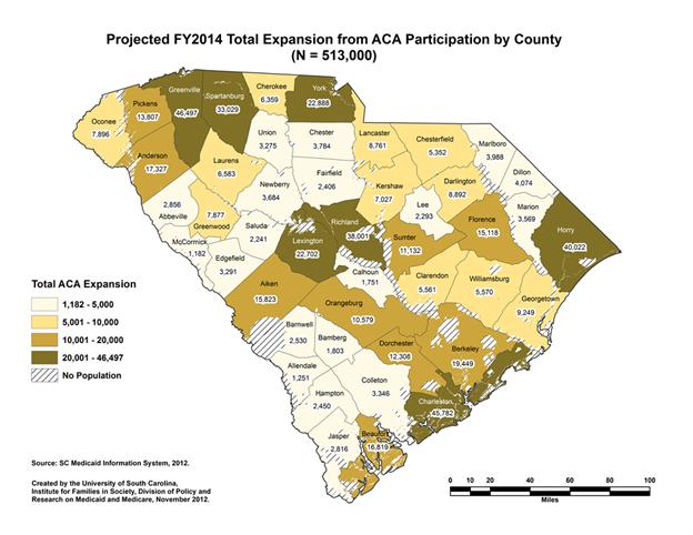
Figure 1
The first (Figure 1) shows by county DHHS’s estimate the number of people enrolling because of the Affordable Care Act and an expansion. Those include 352,000 eligible because of the expansion and an additional 161,000 who are already eligible but not enrolled. Not surprisingly, the highest numbers are where the most people live rather than in the low-population, high-poverty I-95 Corridor.
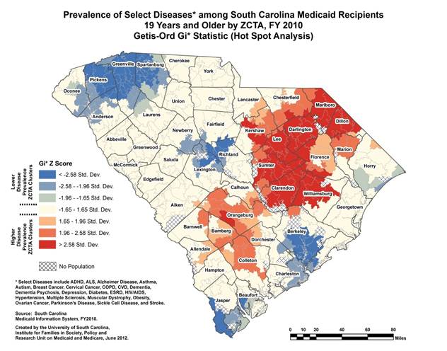
Figure 2
The second (Figure 2) shows the prevalence of what may fairly be described as a hodgepodge of diseases and conditions among current Medicaid enrollees showing (in Z-scores, standard deviations) how far above or below a random distribution of those diseases statewide a zip code falls. Only the darker two reds and blues are significantly different from a random distribution at the .05 level. Not surprisingly, the sickest Medicaid recipient communities are in the I-95 Corridor, while the healthier Medicaid recipient communities are in more urban areas. That, however, is different than saying that the comparatively healthier urban areas don’t have lots of sick people … probably many more than the low-population rural areas. We have requested the underlying incidence data from Professor Ana Lopez-DeFede of the Institute for Families in Society who prepared the map.
Leaving aside the fact that the two maps provide information on two separate populations (those currently enrolled[1] and those who might enroll), the maps can’t be compared because you are then comparing incidence (how many) to prevalence (the proportion) .

Figure 3
We created the map in Figure 3 to show SCDHHS estimate of FY2014 enrollment, assuming a Medicaid expansion and including currently eligible folks who enroll, as a percent of the population 18 and above from the 2010 Census. The large urban counties no longer jump out at you. Clarendon and Williamsburg (with projected enrollments of only 2 % of the statewide estimate) do.
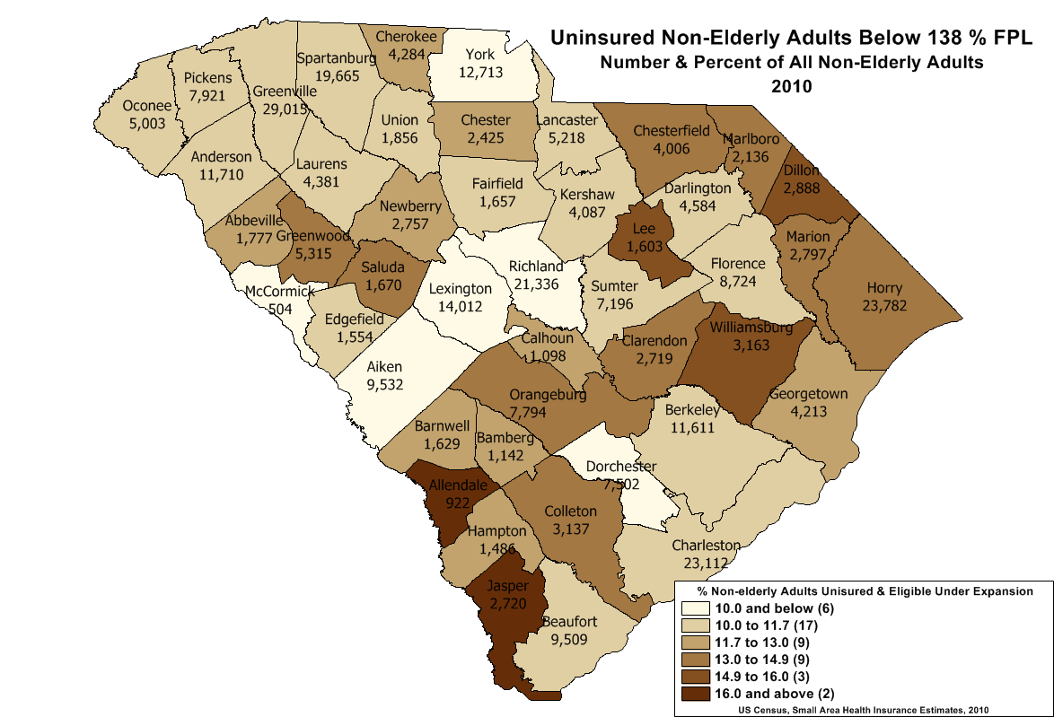
Figure 4
The map in Figure 4 shows the potentially eligible uninsured population as a proportion the non-elderly adult population. Although neither of these maps is on the same scale as the disease prevalence map (Figure 2), each shows a very different picture than Figure 1 and a picture closer to the prevalence map (Figure 2).
Director Keck juxtaposes these maps for two purposes. The first is to suggest that insurance is not the answer because all of the folks have coverage through Medicaid and yet are still sick. Something else (the “Social Determinants of Health”) explains the hot spots in the I-95 corridor. Hardly so based solely on this evidence. It shows that among folks with Medicaid, there are differences in health status defined by a measure lumping autism and Alzheimer Disease in with cervical cancer and HIV/AIDs and other ailments which appear to correlate with overall levels of poverty in those communities. However, absent more data we can’t tell what it means. Are there particular diseases driving the prevalence in some areas? Is this the result of differential age composition?
The second thing that Director Keck suggests is that because among current Medicaid enrollees County A, a rural, low populated county with a higher than average proportion of those recipients with this collection of diseases and conditions and in County B, an urban, highly populated county, with a lower than average proportion suffering these ailments, the state should put its health care dollars into County A. Governor Haley’s decision to reimburse rural hospitals for all of their uncompensated suggests this approach. Clearly, rural hospitals have a harder time shifting costs than urban hospitals. But that doesn’t mean that we should ignore the health needs of low-income South Carolinians because a hot spot map of a hodgepodge of diseases among current Medicaid enrollees shows that prevalence of that hodgepodge of diseases is higher in rural areas. It probably only suggests more severe problems with health delivery systems in those rural counties … something that could much more readily be fixed with the additional dollars a Medicaid expansion would bring to them.
[1] It is unclear which age groups are included in the prevalence map. It likely includes children and seniors, even though the expansion principally relates to the non-elderly adults who are not eligible for CHIP coverage or Medicare. In testimony before the Senate Medical Affairs Subcommittee looking at the expansion, Director Keck said, “I’m not sure of the age distribution of this group.”

In the words of the wise Mark Twain, “there are lies, damn lies, and statistics.” Thank you for so clearly explaining these often used and always misleading maps which demonstrates Mark Twain’s wisdom.
Pingback: [GRAPHICS] A Statewide Look at Medicaid Expansion « South Carolina Healthcare Voices
Pingback: A Tale of Two Maps: Misdirection in the Medicaid Debate « SC Justice Watch